There are those temporary art exhibits that come around every fear years with a political message. However, not many are as blatantly obvious as the one in the temporary exhibition, Avant-Garde in Everyday Life. The show, which has recently left the museum, is a look at the development of art by the Avant-Garde during the early 20th century. It follows the steps by six influential artists of how the art changed from simple texts to some of the most powerful artworks that fueled the rise of Communism and Nazism.
The gallery is a two chambered show. The first area works as an antechamber, showing how ads and instructional manuals changed during this time period. They evoked emotion, using flashy words and enticing images to get people involved with the product.
The second room, though, is artwork from the Communist party illustrating how a strong Soviet Union would be good for the people. It also shows how people working for the government makes them feel better. There are kids exercising, building strength to power the Iron Curtain.
These eventually influence the German Dada movement. They start producing art that portrays the Nazi party in good light. There are photos of how racial profiling will make for a better future. There are pamphlets of how Aryans are always happier and better than the regular people. These photos spurred the Nazi regimes popularity.
The Avant-Garde in Everyday Life exhibit is a valuable, educational exhibit that allows the viewer to understand how powerful art could potentially be. It portrays how dangerous art can be in the hands of the right people.
Wednesday, October 12, 2011
Wednesday, September 28, 2011
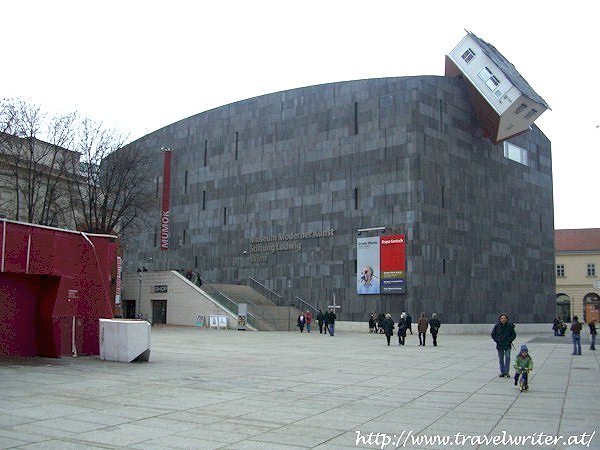
Designing the Weird
As of late there has been a recent email chain going around about some of the most odd buildings in the world. Yes, being odd for oddity sake has its purposes. Sometimes it's interesting, sometimes it's done just to be proven that it can be. But when creating monumental structures for years to come, it creates an unnecessary "WTF" moment. The Museum Moderner Kunst in Vienna (roughly translated the museum of modern art or MUMOK for short) takes the cake on being completely weird.
It's a normal looking structure with a house upside down built into the roof like it's cutting the building in half. It is interesting at first, in fact quite comical. But are we moving in a direction where that is what is 'modern?' Architecture is still an art form and to discredit the basic joys of architecture seems to be making a mockery of it. In hundreds of years, hopefully that museum will still be standing. Would a work of art like that still be considered modern?
It seems that modernity is something relative to what we see now. In fifty years, a building like that would be considered contemporary, in hundreds, it will be the ancient past. Do we as a society want to be known as being the generation that was weird for weird's sake? Are we designing art that when looked back upon in the future, people are going to think, "Wow thank God we're not them." Everlasting things like the MUMOK should be designed with the idea that they represent a culture today and sometimes that culture doesn't share the idea of pushing the envelope of being strange.
Saturday, May 7, 2011
Thor - Even a taser could bring it down...
Twelve cents a copy. That was the original price to 'Journey into the Mystery' of the Mighty Thor, the Norse god of lightning, thunder and overall strength. Created by Stan Lee and script writer Larry Lieber, using the god as a superhero in Marvel Comics, Thor burst out onto the comic scene in 1962. Fast forward almost fifty years and today that same character now appears in a summer blockbuster. It's too bad, though, that writers Ashley Miller and Zack Stentz forgot to realize that there is a whole backlog of mythology that just seems to escape the script. The result is a film that seems to have been produced just for the sake of making a few extra dollars.
The storyline follows Thor (Chris Hemsworth) as he is banished from his home world of Asgard right before being announced king. When a group of thieving Frost Giants from Jötunheimr attempt to steal a mythical casket from the war room, Thor breaks a truce with the Frost Giants and is exiled to Earth as punishment by his father, Odin (Anthony Hopkins). The story is the tale of a child becoming a wise leader in a trial-by-fire test with Thor being stripped of all his godly powers and having to survive as a regular human being.
While this storyline may sound great on paper, it's hard to relate this film back to any of the predecessors on the myth. While the comics do not strive to pay too close attention to the original mythology, the film seems completely detached from the legend and pays homage to the comic that it came from only in passing as a joke.
For example, there's one scene where Thor is handed a t-shirt with a name tag still attached that reads “Donald Blake.” When asked who that was, Doctor Jane Foster (Natalie Portman), who eventually turns into Thor's lover, responds that it was her ex-boyfriend. To anyone not familiar with that name, it was the name that Thor used when he was condemned by his father to be a crippled human being on Earth until he learned a lesson. The mockery feels almost insulting when Jane responds, “It was the only clothes I could find that would fit.” The whole scene seems to make fun of the the fact that Donald Blake and Thor were the same person being that they were the same size. It also adds additional insult since the writers knew exactly what the original storyline was and seemed to not care when they intentionally decided to ignore all of it.
There are more instances where this film lampoons the comic, one of the biggest mistakes being that in the comics, Odin angers his father by love Earth so much he does not want to return to Asgard, yet in the Thor is someone dying to get back to his home world. It happens so frequently that it seems the producers didn't care how the movie worked as a piece in a larger franchise as long as it sold a lot of tickets. The end result is a movie that throws in enough of Stan Lee's original content that attempts to appease the fans, while still giving a big one finger salute to overall themes within the comics. It gave Miller and Stentz the ability to write without any duress from the existing storyline.
To movie goers who never read a single copy of The Mighty Thor, it might not make the slightest difference in the world. To anyone who liked the comics, Thor will be a saddening recreation of an early Marvel classic. Not considering that it spawned from a comic book, the movie itself is good at best.
Those who are looking for a graphics love fest, it's no Pandora from Avatar, but Asgard is definitely eye catching. The floating steel decorations, the perfectly geometric arches of the city, how it sparkles against whatever sun that floats in the sky, the realm of the gods truly is a beautiful world to be in. Bright colors pop out at the viewer, being essential since after all, Nordic gods do travel by rainbow bridges. The only warning to give about the cinematography and camera work is that in the style of director Kenneth Branagh; he slants the camera in far too many shots and it looks like the actors are going to slide off the screen sometimes.
If debating whether to see the 2D version or 3D version, the 2D version works far better. There is a fight scene on Jötunheimr that is almost impossible to see through the darkness and inherent blurriness of 3D. The 3D does not add much to any scenes other than landscapes of Asgard where the bright shining light looks prettier. Unfortunately, in major metropolises it's hard to find that many 2D showtimes. It lends the viewer to believe the 3D was included without artistically seeing if it was worth it or not.
In regards back to writing, the storyline is incredibly cliché. Boy thinks he's ready to be a man and is smart enough to lead, father doesn't think so and sends him on a journey, boy comes back with knowledge gained along the journey and is ready for the task at hand, this movie couldn't be more formulaic. The staff must have known it was so generic since there were plot twists that seemed to be forced in towards the end of the film.
The dialogue seems ridiculous also. The characters in multiple places asked, “Is this madness?” It felt like a toned down version of 300, where instead of watching three hundred ripped guys run around with unchecked temperaments, it was a single guy. There was even a scene where Thor walks into a pet shop and asks for an animal to ride. This didn't even make sense. Thor saw that people drove around in cars, could see all the animals for sale, and should have been able to deduct that there were no ride-able beasts in a pet store. Especially when you find out later that Thor is highly intelligent and already knew the mode of transportation of Earthlings.
The banality of humor became painful at a certain point in the movie. Whoever thought it was a great idea to have a recurring theme of Thor being hit by cars was gravely mistaken. It was laughable. Also, there's a scene where Thor smashes a coffee mug into the ground asking for another cup. Not only was he smart but incredibly courteous. It felt forced and didn't match the persona of the character at all.
On top of that, it would have been nice if the staff had at least one creative idea instead of having an obvious overall theme using the sword in the stone as your basis. Instead of a sword, it's a hammer but it's the exact same idea; the person worthy to lead is the only one who can take the hammer out of the ground. The creativity level in the drawing room was an all time low when this idea was sparked.
Also, the whole coming of age storyline would not have been so terrible had it not repeated itself. Self-sacrifice was trite to begin with, but then to repeat that same theme again was a mistake. Thor already suffered once, give him at least a victory lap.
The film is not the greatest ever. It does visually appealing though with some nice fight scenes. The whole point of this movie, though, appeared to give some background story for the upcoming Avengers film which the character Thor will have a place in. Even an allusion to Tony Stark from Iron Man was included. However, with the price of a ticket being fifteen dollars, and that original comic costing the same price as a piece of gum these days, it might be hard to justify getting in your car, spending all that money on gas, and seeing a movie that just doesn't deliver on the level that it should have been able to.
Saturday, April 30, 2011
Top Picks
IN FILM:
With strife breaking out in the Middle East, historical films that depict the region seem more real now than in recent history. Reverting back to classics can sometimes reteach us some of the lessons that people learned in the past. David Lean's Lawrence of Arabia brilliantly portrays a world that is misunderstood by Western culture. By engaging the audience in a captivating story about how the Arabic nation was able to fight against the Turks in World War I, coupled with some of the most amazing cinematography shot by Freddie Young, Lawrence can have just as much impact as it did fifty years ago.
The film follows the journey of a young British officer named Thomas Edward Lawrence played by Peter O'Toole. Being a little quirky, he is assigned to lead a revolt in 1916 against the Turks by using local Arab militias. What turns into a basic war film becomes a grand experience, following the psyche of how one man can go from a humble servant of the Royal Forces to a man who believes he is a savior and a god. However, Lawrence does provide a glimpse at current world issue. Even then there was bitterness between local tribes. The film is able to beautifully portray the Middle East in conflict, while still providing a masterpiece that has withstood the test of time.
IN MUSIC:
There are those rare times where something so terrible could be amazing. Atzen musik as a whole has sent culture shocks throughout German speaking countries but for everyone else, especially for some who can't understand a word of the songs, it's a throw-down, get trashed, fun good time. And there are no better geniuses at creating Atzen club beats than Frauenartz & Manny Marc. In their latest attempt at providing beats for youngsters to engage in lascivious orgies, Präsentieren Atzen Musik Vol. 2 comes out much harder than their prior attempts, relying on loud techno sounding bass with high-intensity repeating lyrics that would make anyone ready to party go into frenzy.
With their latest Deutchland topping single Disco Pogo opening up the three disc album, the message is very clear. It's a big 'screw you' to mainstream media with lyrics like, “Die Spiesser sind geschockt, und packen ganz schnell ihre Sachen.” Loosely translated, it means the ordinary people are so shocked they get their things and leave. As the album plays in its entirety, songs cover anything from Germanic pride to sex and boozing it up. While this style of music is not for everyone, for those wanting a full album of fun nonstop party action, Atzen Musik Vol. 2 be keeping you up all through the night.
IN LITERATURE:
Just because a book is small in size, does not mean it doesn't carry the same weight in the minds of the reader. Topping out at at a mere four ounces, Ernest Hemingway's The Old Man and the Sea is a knockout short novel that has the same power as many of his longer works. Helping to secure Hemingway's Nobel Prize in 1954, The Old Man and the Sea is a tale of a solo Cuban fisherman named Santiago who goes out to sea and catches an oversized blue marlin. On his way back to shore, Santiago has to battle sharks who are trying to devour his prized catch.
What makes the story interesting is that there is a clear protagonist, yet to pinpoint a definite antagonist has an array of problems. For example, the fish who Santiago catches is just doing what fish do. It struggles with Santiago, fighting for its life. It's not a monstrosity like Moby Dick is or other various sea beasts who intentionally try to harm the main character.
The sharks, while deliberately going after Santiago's fish, are seen as vicious, yet all they are trying to do is eat. The overall theme that is sometimes described is that Santiago's adversaries are nothing more than the regular cruelty of the world. The story is captivating and the reader is forced into feeling sympathy for this poor old man who seems to be forsaken. It's a story about survival and how the world can bring you down even though you did all the right things.
Sunday, April 24, 2011
The Art of Websites..About Art
If a well designed website didn't help a company flourish in the industry, there would be no reason for organizations to shell out tens of thousands of dollars on a regular basis to have sites that are easy to use and look good. The Art Institute of Chicago is no exception in having a finely tuned page that is professional looking with usability a prime aspect to the design. Even with simple boxes of information that are not too ostentatious, the website found at http://www.artic.edu/aic maintains a sophisticated look by incorporating the artwork and Flash drop down menus in a clean cut, elementary format.
When first entering the site, the first thing noticeable is a gigantic news ticker that informs people of the upcoming exhibitions at the museum. The creative use of photographs of the artwork found in the exhibit add a feature that pulls the eyes in and makes the viewer want to go visit the show. It also helps that the images used are darker and contrast very well against the white background, bringing attention to the artwork.
Beyond the main element, basic information a visitor would need are easy to find right on the first page. Price and times the museum are open are found in the upper left underneath the Art Institute logo, the first place eyes would gravitate to. The very top is where the Flash menus are. It clearly spells out where to find information within the website. There's a search option on the left hand side and the bottom of the page is where links to the contact and site map link are located. The rest of the page are images that link you to other areas that explain features of the museum while visiting.
What enhances the website is that everything is sectioned off in boxes and placed beside others with similar content. The page itself has very little vertical scroll so that if someone needs to find something, it doesn't take more than a few seconds. Once links are clicked, the structure of the website is uniform, making scrolling quick and easy. The page never changes shape so if there's a need to change links fast, the mouse can keep moving towards the same general location even if the site is still loading.
The experience using the Art Institute's website is a pleasurable one. It's quick to move around and it won't hurt your brain trying to access the data that you're looking for. Not only that, it helps that while going through the site, all the different works of art appear throughout, adding context and beauty at the same time. Hopefully, the site would draw people in so much that they wouldn't be able to resist going to see the real thing.
Sunday, April 17, 2011
Robin Hood - Failed attempt at a childhood favorite
Some stories are almost impossible to retell because they are so engraved in people’s minds. Robin Hood is one of these folk tales that to create an innovative piece, the production company has to combat preconceived notions of a character. For instance, there are some people who will see this famous thief and Errol Flynn being the same person because of the 1938 classic ‘The Adventures of Robin Hood.’ Nevertheless, BBC has recently attempted to retell the story of Robin Hood for the small screen, with a series bearing the same title as the main character.
‘Robin Hood’ is the story about a nobleman (Jonas Armstrong) who goes off to war in the Crusades fighting for the honorable King Richard. Upon returning home to the village of Loxley, he finds out the old Sheriff of Nottingham was removed and a new cruel sheriff was put into power by King Richard’s evil brother, King Edward. After ridiculous taxes are implemented, and a few scuffles with the law, Robin Hood is forced to escape to Sherwood Forest where he steals from the rich and gives to the poor, all while saving innocent villagers from tyranny.
Sadly, this new version of the best archer in England brings nothing new or interesting to light. The only big difference between this adaptation of Robin Hood and his predecessors is that instead of being madly in love with the Maid Marion, he is a smooth talking womanizer who at one point attempted to pick up the beautiful daughter of a local farmer. Tack on his desire not to watch anyone else die and you have a very bland, stereotypical character which becomes ridiculous to watch for a whole hour.
Not only is the story a drag, being horribly paced and a repetition of older variations, but the special effects are a joke. Every time the scene takes place in a new village, an out of place bleep goes off and a comical effect of moving text comes across the screen with new location being posted. The only thing the director might have been thinking was that if he added such a jarring sound, it would wake someone up from dozing off from watching the show.
Also the fight scenes are more humorous than anything. From people waving their swords around like they are in a Hong Kong martial arts movie, to the sheriff’s soldiers attacking in groups of one to two even though there are many other soldiers around, all the action sequences feel like jokes. Even if the director was going for a whimsical look, having such jovial fight scenes becomes almost unbearable at a certain point. The question might come up of why the sheriff doesn’t just use all his archers available and shoot Robin.
Moving forward the show really has to start capitalizing on the many different facets of the story of Robin Hood. The storyline could be broken down into the simplest form of a thief stealing from the rich and giving to the poor, but there’s so much more involved in England at the time. There’s civil unrest, class discrimination and other various socioeconomic issues that could be addressed. And while there is a notion that Robin Hood is supposed to be happy with his merry men, there’s also a level of seriousness that has to be involved. It’d be impressive to see someone be happy while almost on the brink of death if this was reality.
Unless the writers bring something novel and enlightening to the story, or at least make the fight scenes more intense, the television will not be tuned into be catching ‘Robin Hood’ on a weekly basis. There’s only so much of a single faced character a person can take before watching becomes dull and boring. The show doesn’t necessarily have to be the next ‘Spartacus’ blood and sex fun fest but at least give the series something intriguing to watch.
Sunday, April 3, 2011
The Aqua
In a city like Chicago, the architectural landscape is highly important. Aesthetics become critical and anything that leans towards the ugly tends to be the bad end of the joke. For example, like calling the new Soldier Field a space saucer. Putting up a modern styled skyscraper poses the problem of having to conflict against the neoclassical buildings that fill the downtown area. However, Jeanne Gang and her team at Studio Gang Architects were able to create an impressive award winning structure that stretches the boundaries of what a building should look like.
The Aqua Tower, found at the 200 N Columbus block, was built in three years and after completion, was an immediately recognized by the architectural community. It won the Emporis Skyscraper Award in 2009 for skyscraper of the year and was in the running for various others. It was also the largest project ever awarded to a firm led by an American woman.
What made the Aqua so special was the daring approach Gang implemented. The building itself is a glass structure, and from a distance would have seemed to be a pure Herculite tower had it not been for the creativity of the balconies. Inspired by limestone protrusions that can be found around the Great Lakes, the balconies are stacked in an almost random array that engulf the glass core. The effect makes it seem like waves come crashing down the sides of the building. These random outstretches of stone, that can sometimes extend up to twelve feet from the frame, also go in and out creating that same wavy sensation going around.
Unfortunately, the things that make the Aqua a great skyscraper also contribute to the pitfalls that Gang stumbled in to. Unlike buildings with similar aquatic names in the Lakeshore East neighborhood like the Tides and the Shoreham, the Aqua is the only one that ventures off in a creative manner for the exterior. The other towers are very conventional and uniform. As years have gone by, Aqua can seem silly where it was placed. The allure of such a structure has dwindled as time keeps rolling on and those beautiful waves lose their eye-catching sparkle.
Another issue is that Gang seemed timid with her idea. The Aqua from afar does not appear to be anything more than a solid structure with weird lighting issue. The light glistening off the glass is not uniform, being broken up by the balconies and looking awkward. There's little visual appeal until the viewer can get closer. Then the true form of the Aqua pops out but it's far more intriguing in photographs than in reality. Certain angles are much more interesting to look up at than others and the wave effect can really only be seen in a few spots.
While there are many downsides to having a design like the one chosen, it still holds its ground as a magnificent work of art. It is easy to tell that the design team worked long and hard to come up with the exact planning of sizes and locations of the balconies to create a splendid rush of water tumbling to the ground. At the end of the day though they could have studied Antonio Gaudi's Casa Mila in Barcelona, Spain and learned some valuable lessons at creating the wave effect, as well as ways to incorporate such an odd looking building into a landscape cluttered by standardized skyscrapers.
Is the Aqua overrated? Probably. It might not be deserving of the skyscraper of the year, especially when taking into consideration that many of the functional assets of the building were hurt by the aesthetics. It doesn't take long to realize how much valuable usable area was consumed by dead space when realizing that if the balconies were rectangles, there would be an enormous increase in size to the balconies. But to claim that it's not gorgeous might be a little ludicrous.
Maybe if Gang went crazy and designed something only Santiago Calatrava would think up, the Aqua would be regarded as one of Chicago greats such as the Chicago Cultural Center. At the end of the day though, had the Aqua been nothing more than a regular building, it wouldn't have even made a dent in the community. It's beautiful, and sadly there's no such thing as a perfect building. For what it's worth, the Aqua is a fine building that stands proud along the banks of the river.
Subscribe to:
Posts (Atom)